
Overhauling mobile.twitter.com from the ground up
Wednesday, 11 July 2012
Twitter is all about making real-time information available to everyone, everywhere. In order to reach every person on the planet we recently released an update to mobile.twitter.com for feature phones and older browsers. We completely overhauled this client from the ground up, a process that resulted in a lighter-weight, faster client that looks and feels like twitter.com and our mobile apps.
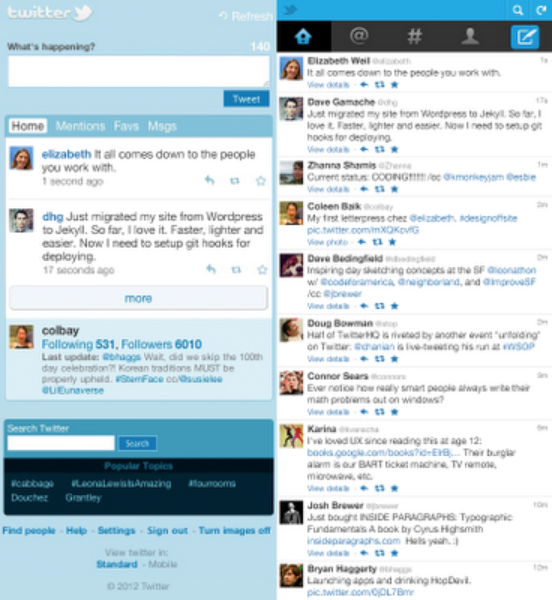
Here’s the home timeline on mobile.twitter.com, before and after the redesign:
On the top level, we brought the user interface in line with the new version of Twitter that we launched back in December, so you can enjoy a consistent experience on any device. Under the hood, we completely overhauled the view layer for our RAILS backend, with new mustache templates and streamlined stylesheets.
Mobile engineering and Design had about nine weeks to design, prototype, develop, test, and calibrate mobile.twitter.com for launch. There were a handful of challenges we took on:
The first thing we did was look at and expand our collection of data. How often do people use the refresh control or load more Tweets? Where were the pain points with sign up or sign in? What Tweet actions did people engage with most? How often did people Tweet? We used data from all of these actions throughout the process to inform design and architectural decisions.
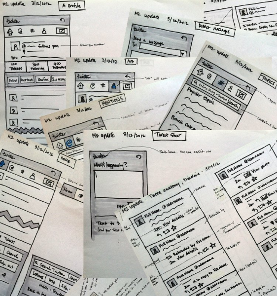
We began the process by sketching out proposals for primary views and navigation. Next, we fleshed out details like the Tweet anatomy and interaction flows for tasks like tweeting, searching, and writing direct messages:
After some on-paper iterations and reviews with the design and mobile-web teams, we quickly jumped into HTML/CSS wireframes that we could begin playing with on targeted devices. Even a simple wireframe of a single view proved extremely valuable in setting the tone for the project. It made the product vision much more concrete and gave us a starting point for front-end work.
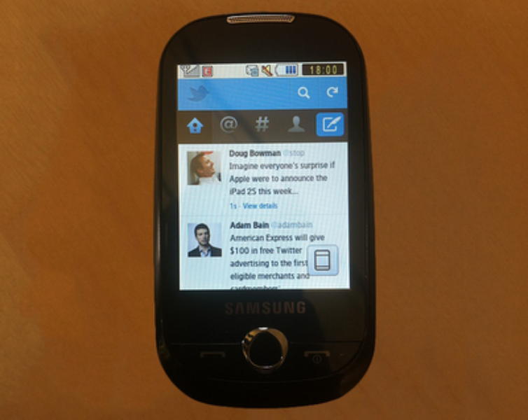
Here’s what the first pass looked like on a Samsung Corby:
Next, we built out main views like “Home,” “Connect,” “Discover,” and “Me.” We added a text-only fork in the stylesheets, built in adaptiveness, and contextualized the Tweet anatomy. This was one of the biggest design challenges that we faced in the update: how to be faithful to the structure and behavior of Tweets that users expect elsewhere on Twitter in extremely low-resolution views? How to accommodate touch, pointer, and five-way input methods gracefully? We took a hard look at the numbers and tested at least three different versions before we made a decision.
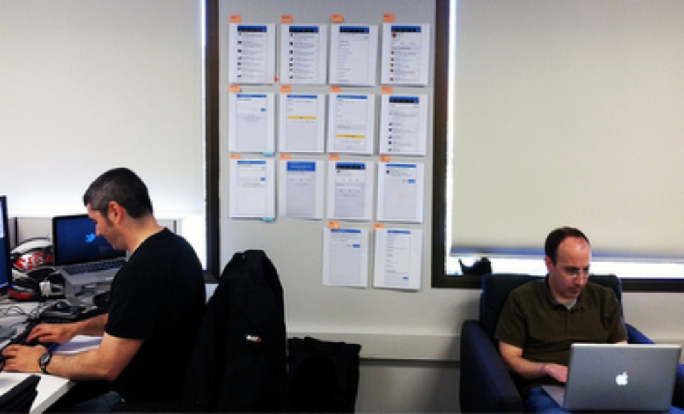
At this point, we had a baseline to work with — but we still needed a comprehensive set of designs for everything else: sign up and sign in flows, logged out views, errors, notifications, and profile subviews like followers and favorites. There was a lot to keep track of, and we found that going back to basics and simply printing out designs to post near our workspace helped orient us. It gave the team a quick, easy way to reference designs while we were working, and a way for us to catch inconsistencies.
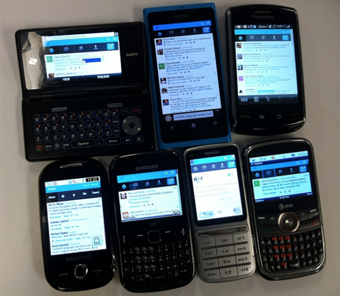
All along the way, we faithfully tested what we were building on an array of devices (we have over 300 in our inventory!):
After more than two months of work, we had a mobile.twitter.com with many improvements including:
When we finally rolled out the new version 100% to our users, we were ecstatic to see so many positive responses:
Of course, we also heard from people about bugs and features not yet integrated. We faved those Tweets to track further progress, and can report that JavaScript support and enhancements for widescreen views are coming soon!
Change is always difficult because it means, among other things, having to relearn what was once comfortable and familiar. But we hope that the initial pains of readjustment quickly lead you to appreciate this faster, more comfortable and easier-to-use mobile.twitter.com on feature phones and older browsers.
Posted by Coleen Baik (@colbay), Designer, on behalf of the Mobile team
Did someone say … cookies?
X and its partners use cookies to provide you with a better, safer and
faster service and to support our business. Some cookies are necessary to use
our services, improve our services, and make sure they work properly.
Show more about your choices.