
Visualizing the 2012 election
By
Thursday, 1 November 2012
Throughout the 2012 election season, the biggest topics and emerging trends have played out on Twitter, offering an extensive dataset for our Analytics team to explore. Prominent issues in this year’s campaign range from Pell Grants for students to Medicare for the elderly, from coal production to clean energy. Of course, the salience of these issues varies greatly by state. A great deal of media and campaign attention focuses on statewide polling, so we’ve been particularly interested in how users engage with political content on a statewide level.
At https://election.twitter.com/map/, we’ve built a visualization that illustrates people’s reaction to and engagement by state to Tweets from @MittRomney and @BarackObama. While the Twitter Political Index analyzes Tweets about the candidates, Nicolas Belmonte and I have also been studying how citizens interact with Tweets from the candidates. We also want to see what insights you can glean from Twitter data, so this visualization is fully interactive.
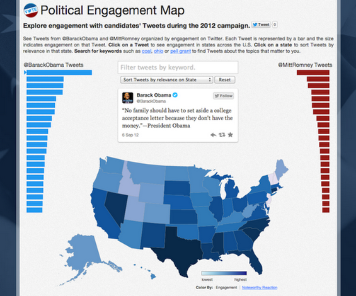
Here’s how it works: Select Tweets, represented by a bar, from the left or right columns. Tweets are organized by engagement level, and the size of the bar indicates the level of engagement that Tweet received. Hovering over the bar previews the Tweet text, and clicking on it will show you the state by state engagement level. You can also search for specific terms to see Tweets from @BarackObama and @MittRomney about the topics that matter most to you.
Let’s start with an example from our visualization. This map shows statewide engagement rates for Tweets that mention coal:
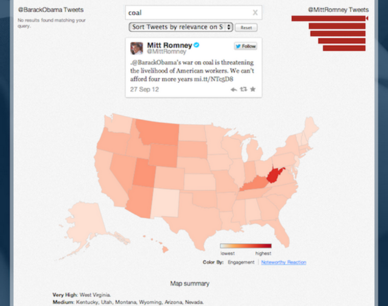
The darker color indicates a higher rate of engagement (measured by the number of favorites and retweets). As the map shows, states that are leading producers of coal — West Virginia, Kentucky, and Montana — are among those with high engagement rates.
Clicking on “Noteworthy Reaction” will reveal where a Tweet had an elevated level of engagement: people in that state engaged with the Tweet more than they typically do other Tweets.
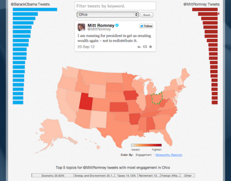
To better understand the particular issues that resonate most in a given state, just click directly on that state. If you look at Ohio — a critical swing state — you’ll see that the most relevant topics from @MittRomney’s Tweets are the economy, energy/environment, taxes, and retirement. Meanwhile, the Tweets from @BarackObama that resonate the most in New York deal with abortion, terrorism, and foreign affairs.
At https://election.twitter.com/map/, you can explore the political engagement map for yourself. It’s fully interactive so that you can analyze the Tweets, topics, and states that most interest you. Share your discoveries to us by tweeting @gov.
Posted by Miguel Rios (@miguelrios)
Analytics Team
Did someone say … cookies?
X and its partners use cookies to provide you with a better, safer and
faster service and to support our business. Some cookies are necessary to use
our services, improve our services, and make sure they work properly.
Show more about your choices.