
Introducing a new look for TweetDeck
Wednesday, 5 June 2013
In order to deliver a number of new and often requested features, we’ve updated TweetDeck’s look and also improved its usability. It’s a step forward in making TweetDeck feel fresh, as well as enabling some great new functionality.
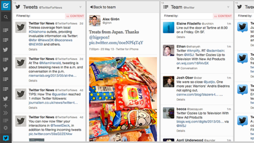
In line with Twitter’s own design aesthetic, this update delivers a lighter and simpler TweetDeck design. We moved the top bar to the side, and created some significant usability improvements around column reordering and easier navigation.
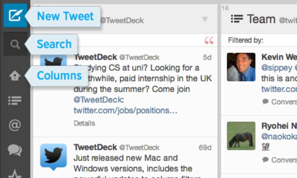
At the top is the New Tweet button; clicking on this will open the familiar New Tweet window. Next is the Search icon which opens the Search window when clicked.
The next series of icons represent the columns you have in your TweetDeck. Roll over each item to get the full title.
Click on a column icon to move the display to that column, which is especially handy if you have a lot of columns. These column icons also scroll up and down in the sidebar so you can interact with all your columns, regardless of how many you have or how large or small your screen is. For very quick column reordering you can drag a column icon up or down to change its position.
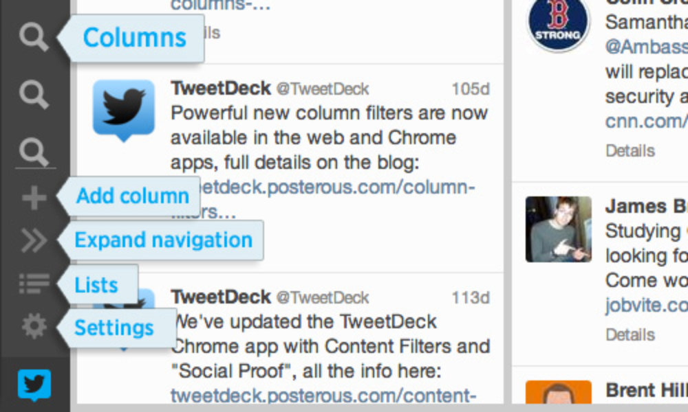
Underneath the column icons is the “Add column” icon.
And finally at the bottom of the sidebar you’ll always find these three icons:
Did someone say … cookies?
X and its partners use cookies to provide you with a better, safer and
faster service and to support our business. Some cookies are necessary to use
our services, improve our services, and make sure they work properly.
Show more about your choices.