
Visualized: The world of verified users
Thursday, 18 July 2013
Ever wondered which of the world’s most famous people follow each other on Twitter?
Click image to explore the interactive map
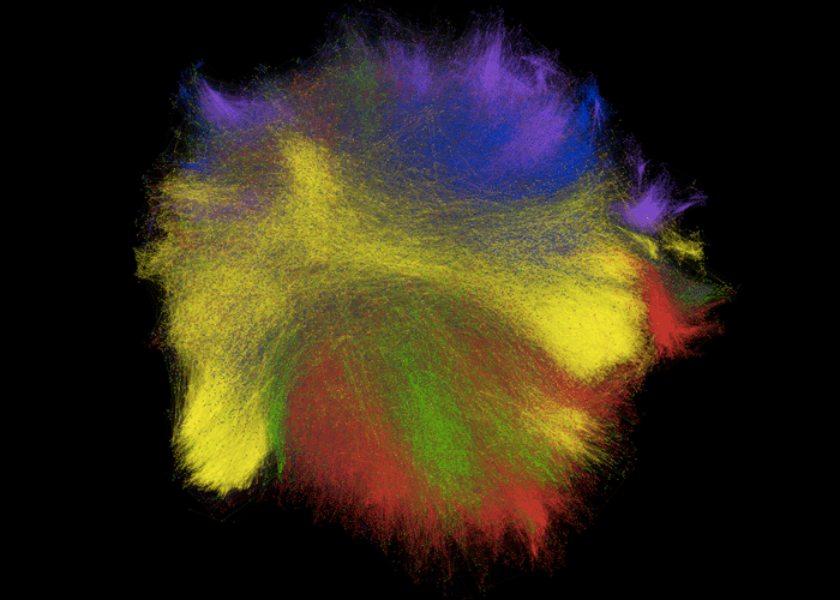
This beautiful visualization, created during Twitter Hack Week by our very own Isaac Hepworth (@isaach), shows the mutual follows between over 50,000 verified Twitter users — that is, which verified users follow each other.
The users in this map are colored by category: blue for news, purple for government and politics, red for music, yellow for sports and green for TV — the five largest categories on Twitter today.
One of the many fascinating things about this diagram is that it shows which accounts tend to follow those outside their category. For example, the reason that blue and purple almost seem to merge into one another is that journalists tend to follow politicians, and vice versa. The same is true of TV and music, down in the bottom right, with musicians and TV stars following each other often.
There are clusters of interest all over the place, providing unique insights into how famous people use Twitter.
We can even see how usage varies by country. For instance, on the left you have a purple swath of government users following yellow sports users — it turns out these are largely UK politicians following prominent athletes. In the top middle, a line of Spanish-language pop stars, TV companies, sportspeople and government bodies. The purple outcrop at around two o’clock is Japanese politics; the red island below it is Japanese music.
What else can you find? Let us know at mediablog@twitter.com
Did someone say … cookies?
X and its partners use cookies to provide you with a better, safer and
faster service and to support our business. Some cookies are necessary to use
our services, improve our services, and make sure they work properly.
Show more about your choices.