
Observability at Twitter: technical overview, part II
Tuesday, 22 March 2016
This is the second post of two part series on observability engineering at Twitter. In this post, we discuss visualization, alerting, distributed tracing systems, log aggregation/analytics platform, utilization, and lessons learned.
Visualization
While collecting and storing the data is important, it is of no use to our engineers unless it is visualized in a way that can immediately tell a relevant story. Engineers use the CQL query language to plot time series data on charts inside a browser. A chart is the most basic, fundamental visualization unit in observability products. Charts are often embedded and organized into dashboards, but can also be created ad hoc in order to quickly share information while performing a deploy or diagnosing an incident. Also available to engineers are a command line tool for dashboard creation, libraries of reusable monitoring components, and an API for automation.
We improved the user’s cognitive model of monitoring data by unifying visualization and alerting configurations. Alerts, described in the next section, are simply predicates applied to the same time series data used for visualization and diagnosis. This makes it easier for the engineers to reason about the state of their service because all the related data is in one place.
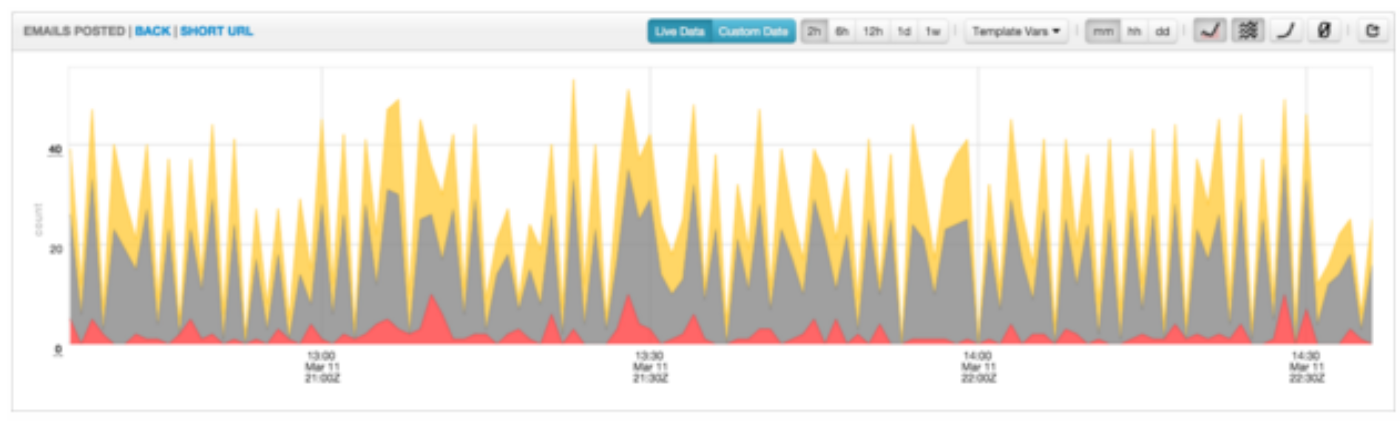
Dashboards and charts are equipped with many tools to help engineers drill down into their metrics. They can change the arrangement and presentation of their data with stack and fill options, they can toggle between linear and logarithmic chart scales, they can select different time granularities (per-minute, per-hour, or per-day). Additionally, engineers can choose to view live, near real-time data as it comes into the pipeline or dive back into historical data. When strolling through the offices, it’s common to see these dashboards on big screens or an engineer’s monitor. Engineers at Twitter live in these dashboards!
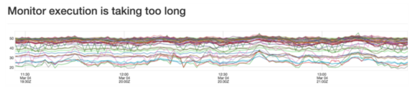
Visualization use cases include hundreds of charts per dashboard and thousands of data points per chart. To meet the required browser chart performance, an in-house charting library was developed.
Alerting
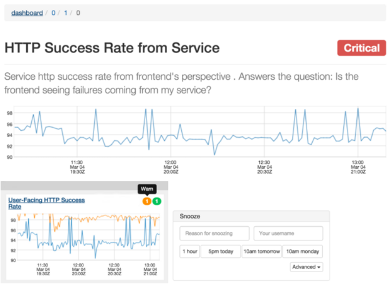
Our alerting system tells our engineers when their service is degraded or broken. To use alerting, the engineer sets conditions on their metrics and we notify them when those conditions are met.
The alerting system can handle over 25,000 alerts, evaluated minutely. Alert evaluation is partitioned across multiple boxes for scalability and redundancy with failover in the case of node failure.
While our legacy system has served Twitter well, we have migrated to a new distributed alerting system that has additional benefits:
The visualization service allows engineers to interact with the alerting system and provides a UI for actions such as viewing alert state, referencing runbook, and snoozing alerts.
Dynamic configuration
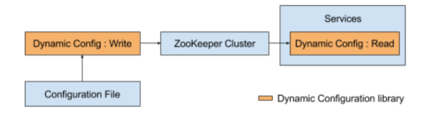
As our system becomes more complex, we need a lightweight mechanism to deploy configuration changes to a large number of servers so that we can iterate quickly as part of the development process without restarting the service. Our dynamic configuration library provides a standard way of deploying and updating configuration for both Mesos/Aurora services and services deployed on dedicated machines. The library uses Zookeeper as a source of truth for the configuration. We use a command line tool to parse the configuration files and update the configuration data in Zookeeper. Services relying on this data receive a notification of the changes within a few seconds:
Distributed tracing system (Zipkin)
Because of the limited number of engineers on the team, we wanted to tap into the growing Zipkin open source community, which has been working on the OSS Twitter Zipkin, to accelerate our development velocity. As a result, the observability team decided to completely open source Zipkin through the Open Zipkin project. We have since worked with the open source community to establish governance and infrastructure models to ensure change is regularly reviewed, merged and released. These models have proven to work well: 380 pull requests have been merged into 70 community-driven releases in 8 months. All documentation and communication originates from the Open Zipkin community. Going forward, Twitter will deploy zipkin builds directly from the Open Zipkin project into our production environments.
Log aggregation/analytics platform
LogLens is a service that provides indexing, search, visualization, and analytics of service logs. It was motivated by two specific gaps in developer experience when running services on Aurora/Mesos.
The LogLens service was designed around the following prioritizations — ease of onboarding, prioritizing availability of “live” logs over cost, prioritizing cost over availability for older logs, and the ability to operate the service reliably with limited developer investment.
Customers can onboard their services through a self-service portal that provisions an index for their service logs with reserved capacity and burst headroom. Logs are retained on HDFS for 7 days and a cache tier serves the last 24 hours of logs in real time and older logs on demand.
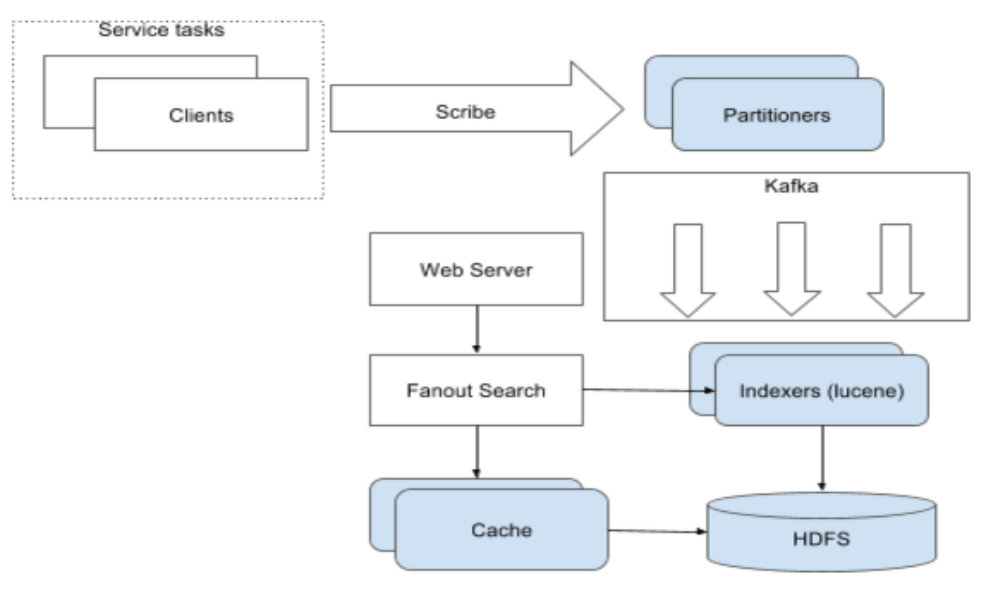
Utilization
As Twitter and observability grow, service owners want visibility into their usage of our platform. We track all the read and write requests to Cuckoo, and use them to calculate a simple utilization metric, defined as the read/write ratio. This tracking data is also useful for our growth projection and capacity planning.
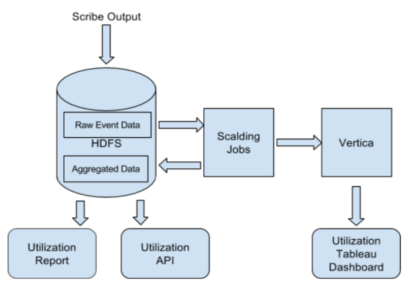
Our data pipeline aggregates event data on a daily basis, and we store the output in both HDFS and Vertica. Our users can access the data in three different ways. First, we send out periodic utilization and usage reports to individual teams. Second, users can visualize the Vertica data with Tableau, allowing them to do deep analysis of the data. Finally, we also provide our users with a Utilization API with detailed actionable suggestions. This API, beyond just showing the basic utilization and usage numbers, is also designed to help users drill down into which specific groups of metrics are not used.
Since this initiative came into play, these tools have allowed users to close the gap between their reads and writes in two ways: by simply reducing the number of unused metrics they write, or by replacing individual metrics with aggregate metrics. As a result, some teams have been able to reduce their metric footprint by an order of magnitude.
Lessons learned
In light of these issues, we switched our collection model from “pull” to “push” and increased our service isolation. Our collection agent on each host only collects metrics from services running on that specific host. Additionally, each collection agent sends separate collection status tracking metrics in addition to the metrics emitted by the services.
We have seen a significant improvement in collection reliability with these changes. However, as we moved to self service push model, it becomes harder to project the request growth. In order to solve this problem, we plan to implement service quota to address unpredictable/unbounded growth.
Learn more
Want to know more about some of the challenges faced building Twitter’s observability stack? check out the following:
Acknowledgements
Observability Engineering team: Anthony Asta, Jonathan Cao, Hao Huang, Megan Kanne, Caitie McCaffrey, Mike Moreno, Sundaram Narayanan, Justin Nguyen, Aras Saulys, Dan Sotolongo, Ning Wang, Si Wang
Did someone say … cookies?
X and its partners use cookies to provide you with a better, safer and
faster service and to support our business. Some cookies are necessary to use
our services, improve our services, and make sure they work properly.
Show more about your choices.