Tips
Mobile app playbook: lessons learned
By
Wednesday, 6 January 2016
Our mobile app playbook series features tips on the tools and processes we’ve learned in building mobile apps.
We know firsthand that it’s hard to build successful iOS and Android apps. We’ve built quite a few: the Twitter app itself, and also lots of apps and samples written from the ground up with no Twitter internal systems or tooling. And of course we’ve learned a lot about how our partners build apps and tackle problems.
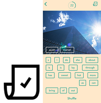
At this year’s Flight conference, we showed off the power of some of the new features from Fabric, with two apps that we created and open-sourced on GitHub: Cannonball, a magnetic poetry game, and Furni, a mobile-first furniture store.
Building these apps has been exciting, and educational. Moving from ideation to product on a (very) small team, we got a lot of assistance from others, and from tools available through Fabric.
Our experience building Cannonball made it so much easier to build Furni the following year. We thought we’d organize what we’ve learned into a chronological playbook that you can use as a guide when you build apps. Over the coming weeks, watch for our series of posts with tips on the tools and processes that we’ve learned.
We don’t pretend to have all the answers, and you certainly don’t have to use all the tools we mention – but we’d like to pay it forward, based on knowledge we’ve gathered from colleagues and learned by making mistakes. Of course, we’re not the only ones with knowledge to share, so please Tweet your tips using #MobileAppPlaybook and we’ll gather your suggestions for future posts!
Every app starts as an idea. We’ve all built just-for-fun projects to play around with new frameworks or cool hardware – but the apps that go places solve real problems, enable new and interesting experiences, or entertain.
Even though good design seems obvious when you see it, designing for great user experiences isn’t a simple process. Big companies devote entire teams to it – but if you don’t have the luxury of having a big team, there are still ways to create a solid UX on your own.
In the future, we could certainly extend Cannonball to make the process of building a poem more visually dynamic, or update the horizontal scrolling behavior in Furni’s main screen to feel more modern.
But we didn’t in v1, which leads me to the next thing we tackled.
With Cannonball and Furni, building an open source-able sample helped us focus on a few operating principles. We knew the app wasn’t going into wide release immediately, so we didn’t waste time on premature optimizations — but knowing that the code would be published for anyone to see was the impetus we needed to write it right.
“Right” in this case meant nicely decomposed, easy to read – and also not crashy. Unless I’m hopelessly hooked, a new app loses me if it crashes all the time, particularly on basic or critical processes. And with mobile bounce rates at nearly 40%, I’m not the only one.
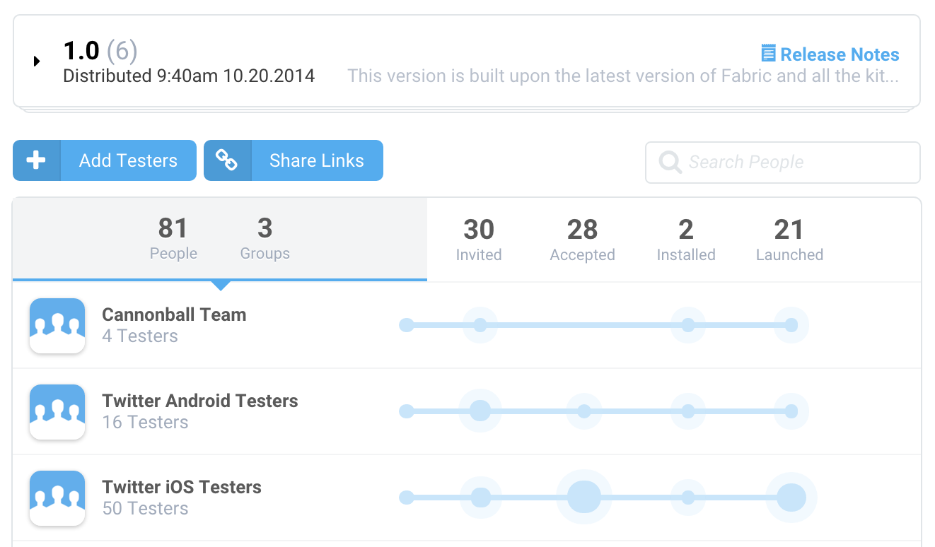
With Cannonball in particular, we were trying to release the open source code simultaneously on Android and iOS, while also shipping it to the App Store and Google Play in time for the Flight conference, while building on a platform that was (at the time) top secret. Our tester pool was pretty limited (employees only), and the number of things that could go wrong on any given build was very large. We also knew that the people downloading it on day one would be developers – and that a major part of our platform was crash reporting. No pressure.
Using Crashlytics Beta really saved us. Simulators and emulators can take you pretty far for some amount of testing, but there’s no substitute for getting your app on real devices, being used by real people who use and abuse it in ways you couldn’t predict. Having our colleagues test out the apps helped us find and solve dozens of bugs we had never seen before.
And we knew how to track down and pester the people who hadn’t helped.
The two people who installed but didn’t actually test our day-before-Flight build? Dead to us.
The combination of beta testing, crash reporting, and analytics was particularly helpful for getting a sense of how “bad” things were inside the app, and how effective our testing was. It doesn’t matter if you send a build to 500 people if only 50 of them try it, and only 20 get past logging in: your app is essentially not tested.
We were able to get details about how many people tested, for how long, and the top screens where they spent their time in the app– and, on the flip side, which ones hadn’t been as thoroughly tested. We were also able to see the percentage of people who actually experienced a crash — important information, when seeing any reports feels scary (don’t worry, everyone has lots of them). Putting those crashes into context with numbers around the actual end user experience helped us figure out what was an edge case and what was a showstopper.
Beta testing the app and actively using Crashlytics for monitoring crash reports didn’t just help us save face on the day of Flight; it’s helped us retain hundreds of monthly active users for Cannonball – even a year after release.
And hey – if you’ve run either of the sample apps and are seeing lots of crashes in your own Fabric dashboard, we’re always accepting pull requests.
Next time, we cover our experience with account systems and social login. Tweet using #MobileAppPlaybook and share some tips of your own!
Did someone say … cookies?
X and its partners use cookies to provide you with a better, safer and
faster service and to support our business. Some cookies are necessary to use
our services, improve our services, and make sure they work properly.
Show more about your choices.