
The NBA Finals visualized
Tuesday, 9 July 2013
When LeBron James (@KingJames) led the Miami Heat to a fiercely-battled victory over the San Antonio Spurs during the NBA playoffs in June, fans around the world had something to say about it on Twitter. Twitter data has helped broaden our view of who the fans are and where their conversations take place around the NBA finals and other major events throughout the year.
 Click image to explore the interactive map
We know this because of geotagging – when users choose to mark their Tweets with their location. We have written recently about how this means you can see who is tweeting and where - and how useful that data is.
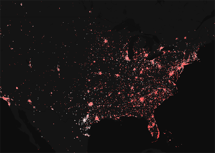
To reach fans of the Miami Heat, for instance, you might focus on people who live in South Florida – but this visualization, produced using mapping tool CartoDB, shows mentions of “Spurs” and “Heat” (and associated terms for each team) by location.
It shows how the Heat’s — and Spurs’ — support is spread across the world and across time zones.
It shows how the Heat’s — and Spurs’ — support is spread across the world and across time zones. For instance, see the clusters in Atlanta, Georgia, and zoom out to see those in the Caribbean, London or Paris. Or hit “dynamic” to see the dots animate over time – with explosions of color during the big games – and how, when it comes to Twitter, fans are truly everywhere.
Have you done anything interesting with Twitter geodata? Let us know about it. Send a note to mediablog@twitter.com.
Did someone say … cookies?
X and its partners use cookies to provide you with a better, safer and
faster service and to support our business. Some cookies are necessary to use
our services, improve our services, and make sure they work properly.
Show more about your choices.