Millions of people, businesses and brands use their Twitter profiles to publicly express their identity and personality. As this expression has evolved over time, we needed to evolve the experience. Here we highlight some of the events, decisions, details and processes that went into launching new profiles on Twitter.
The Twitter profile is often considered the front door to Twitter. Profiles are surfaced through search results and Twitter @usernames are closely associated with public identity. When the last version was designed a few years ago, the digital landscape and use cases were substantially different than today. Therefore, the design focus was distinct as well.
Initially, Twitter profiles were mostly used by broadcasters and brands. Additionally, they were designed in a landscape of smaller-sized devices, so profiles focused only on a top level of hierarchy — the name, number of people followed and the number of followers. As Twitter grew and evolved as a platform, it became more widely seen as a channel for self-expression.
We set out to update the design in order to support greater self-expression and better adapt to new device sizes.
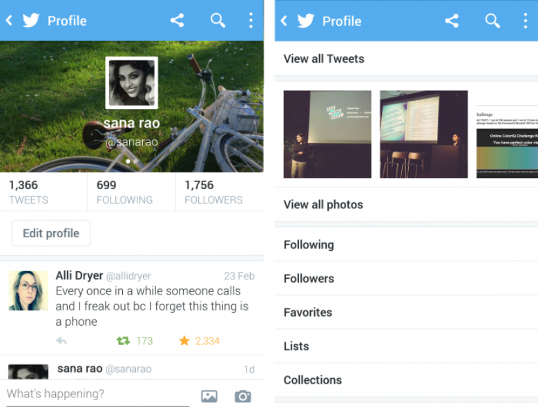
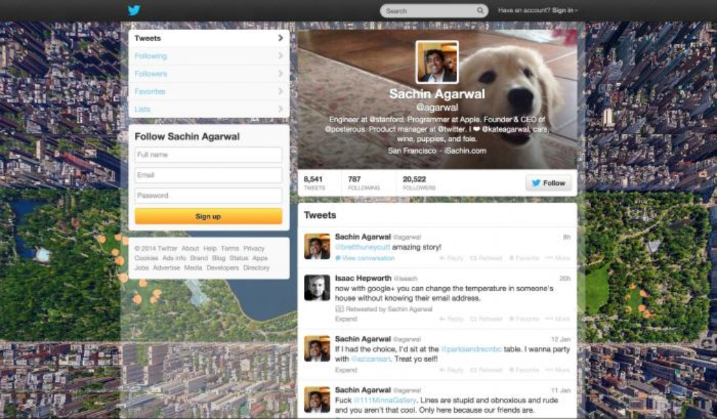
To kickstart the process, we collaborated with researchers to understand user motivations, desires, needs and behaviors. This helped us understand the key factors to consider in setting a design direction.
We learned that each person who uses Twitter is different, they have unique personalities and individual thoughts. Our challenge was to design a new profile that could scale evenly across demographic groups, geographies and continents – while still providing the building blocks for each profile to be uniquely representative of an individual. In order to do this we chose to focus on and highlight the content created and curated by users so that each profile would look unique.
To get a complete sense of the personality of a user, we wanted to surface not just what people express through their Tweets, but the other mechanisms they use to signal interests, likes and dislikes.
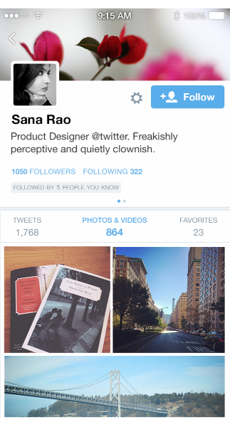
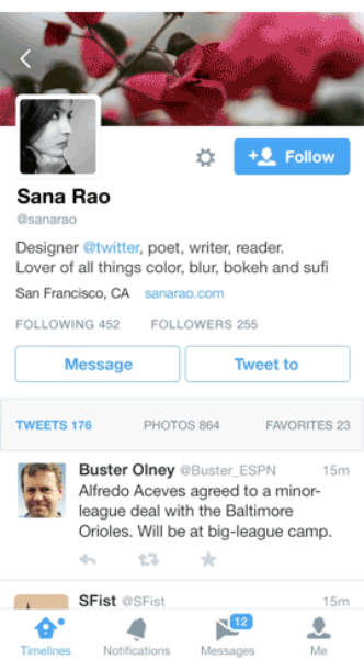
We began by consolidating all the different ways people express themselves on the platform and brought them together on the profile page. If something was hidden we surfaced it; if it was behind a swipe we removed the swipe. We brought the user bio (the 140 characters people write to describe themselves) out of the swipe and added an infinitely scrollable timeline of their Tweets, photos and videos. We also brought forward a timeline of Tweets they favorited to present a timeline of Tweets curated by favoriting. By opening up this content, we gave people more tools to understand the profiles they see.
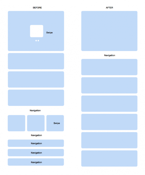
After we surfaced content up to the first level of discovery, it became imperative to create hierarchies around it so it would be simple to make sense of the content, both easily and intuitively. This was especially critical for mobile usage, where space constraint and ease of quick parsing takes precedence over all else.
Our criteria and solutions were:
Every redesign that’s a fresh start warrants careful consideration of the people who are adopting it. For current users we rolled the update out slowly, so people had time to understand what the upgrade was and what it might mean for them. We created an opt-in flow to outline the three main features of the redesign to help navigate the changes.
Seems like Twitter enabled the new profiles for lots more people now. Pretty simple setup process. Looks nice! pic.twitter.com/jySyjmn4zK
— Anil Dash ( @anildash) April 22, 2014
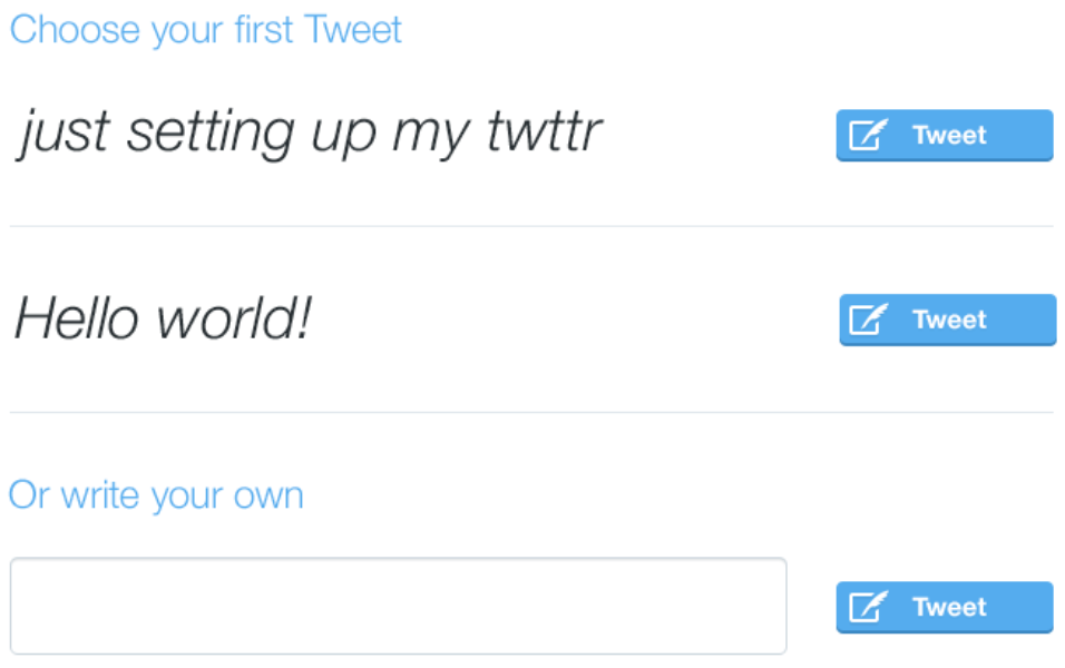
For new users we provided an empty state with suggestions about topics they could Tweet to get started in order to mitigate any hesitation around trying a new platform.
Any designer who has done experiments or A/B testing will tell you it can be extremely valuable, but in isolation these results can give an incomplete picture. Profiles research specialist Marco De Sa helped us collect qualitative data to augment the quantitative data we had, in order to test our assumptions. We ran user research sessions with people to test the new design and give us feedback. Participants came to our usability lab, where we chatted casually about Twitter and observed them using it. These observations highlighted possible usability issues and helped us understand how the proposed changes might affect their use of Twitter.
We tested our first version of the redesigned profile on web, hypothesizing that people would read Tweets on a profile in a comic book-like reading pattern, moving down the page from left to right. But testing revealed that the pattern of the content was overtaking the linear time sequence – the inherent nature of Twitter. We went back to a time-ordered list of Tweets while retaining the rest of the design and immediately saw it become easier to consume Tweets.
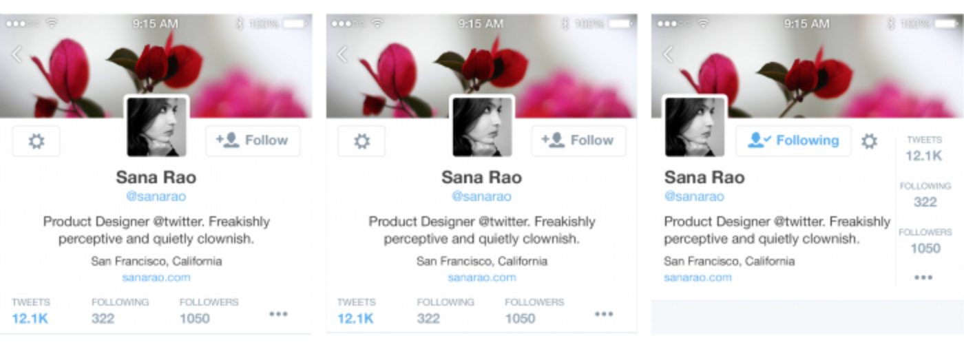
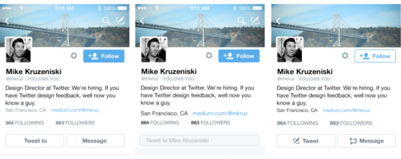
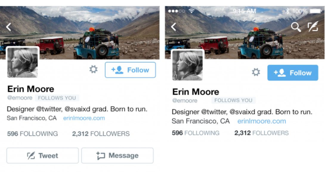
Through testing and research, we found that the action buttons (Direct Message, Tweet) on the profile were competing with the primary action (follow). People were tapping on them simply because they were large tappable buttons. We then removed excess actions to focus only on the follow action and reduce unnecessary decision making.
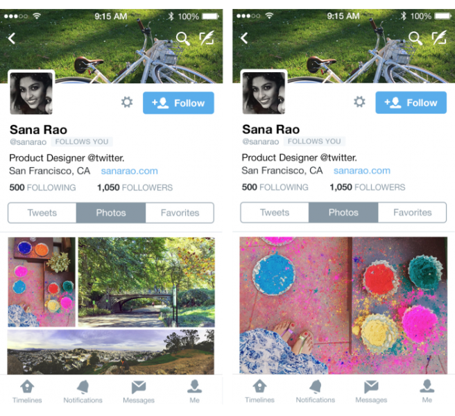
As soon as people landed on a profile, their first action was to navigate to photos in order to quickly get a visual sense of the account. We continued to work on ways that we could make profiles a media-rich experience by changing the thumbnail grid-view to a full-screen immersive photo timeline, eliminating the need to go back and forth between the timeline and the photo viewer.
Over a month-long testing period which resulted in a public launch, we took a look to see how we had done:
On web we saw a 6x increase in the number of Tweet impressions from logged-out visitors browsing profiles and a 2x increase in the number of logged-out visitors who saw an impression of the profiles.
On iOS, the most remarkable change was a 38% increase in people visiting the new profiles and a massive 6x increase in users visiting the media timeline. Similarly, on Android we saw a 128% increase in people visiting profiles and over 2x increase in people visiting and scrolling on the media timeline.
Of course, some reactions to these changes were negative – that’s normal for something so visible. Our users are a passionate and vocal group and it’s valuable to hear all feedback. When we redesigned profiles, we were aware that it would take some time for people to reacquaint themselves with their profile and how to navigate it. But we felt sure that after seeing it, people would find their profile to be a better representation of themselves and a great way to connect with others. What we learned from experimentation and research helped us validate this.
In the end, we know we’ve created a better canvas for profiles. And through the process we ended up building the scaffolding for a highly scalable and customizable platform that’s now being used for many more destination-browsing experiences throughout the product.
Designed in collaboration with Dave Bedingfield, Mike Kruzeniski, Brendan Donohoe, David Bellona, and product partner Sachin Agarwal.
Did someone say … cookies?
X and its partners use cookies to provide you with a better, safer and
faster service and to support our business. Some cookies are necessary to use
our services, improve our services, and make sure they work properly.
Show more about your choices.