
Designing Twitter for Windows 10
By
Wednesday, 29 July 2015
Today we launched Twitter for Windows 10; you can download it here.
When we design products and features for the scale of Twitter and Microsoft, we learn a few new things. We thought it’d be fun to share some of the thinking that went into the final design.
All product designers are taught to understand the problem they’re setting out to solve. In our case, it seemed pretty simple: Windows 10 is coming out, and we wanted to have a fresh version of Twitter available on day one. Easy, right? Well…
The first load of any app is a big responsibility. After all, it’s disappointing when you get an app, decide to try it out and you’re just shown a blank login screen like this. Sad trumpet.

We knew this page could be much more engaging. We wanted to make sure that first experience was genuinely useful — even delightful. It’s easy to mock up a pretty visual, but the page needs to be powered by real content, in real-time, to be valuable. And that requires a lot of engineering effort to get right.
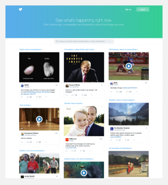
Fortunately, we’ve been doing a lot of work on what we call, unsurprisingly, the “logged-out experience.” This is what you see today when you go to twitter.com as a logged-out user:
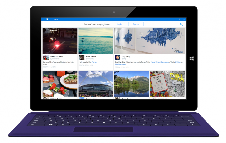
We set out to take a view such as this and make it feel great on Windows 10. And since both Twitter and Windows 10 are used all around the world, we needed to make sure the content was great for everyone, everywhere.
To understand what “great” means, we thought back to some of the original Windows Phone design principles: “personal, relevant, and connected.” Put another way, we wanted the information to be something notable happening, right now, that you might be interested in. Here’s the result:
Speaking of personal, we know firsthand how much Windows users love accent colors. We have two designers on the team who were design leads on Windows Phone, so we knew to look for ways to incorporate accent colors into the app from day one.
One early idea, shown here, was to try putting Microsoft accent colors along the lefthand side in the area that used to be a dark gray. We thought that was interesting — but pretty overpowering.
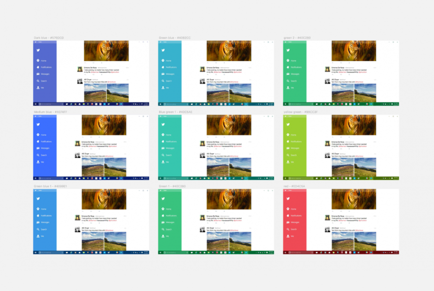
After many, many more experiments, we landed on using accent color to represent the current view in the app, as well as for links and for the title bar across the top, like this:
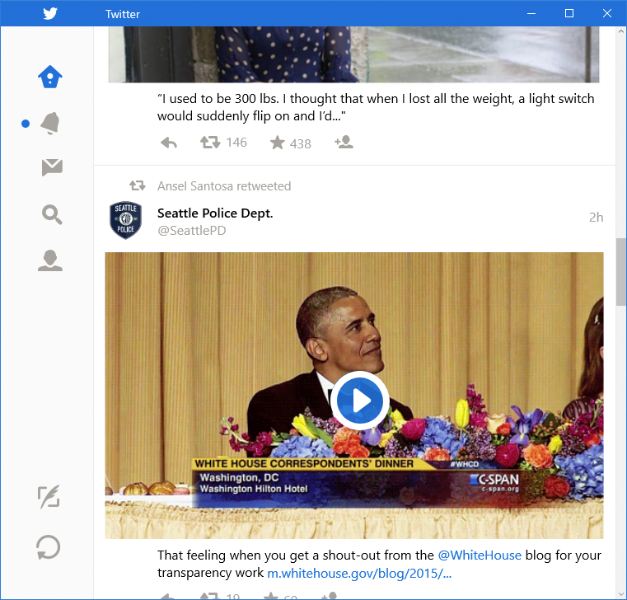
We liked this much more. It’s visually low-key but still brings some of the personalization of Windows 10 into the Twitter chrome.
In Windows 10, Microsoft has announced Universal Windows Apps (UWP), a framework that lets apps scale appropriately to any screen size. In their design documentation, they describe how make one app flex from a four inch phone all the way to a large display mounted on a wall, using what they call “effective pixels.”
We set out to make these concepts work with Twitter’s timeline and had a few options. We could scale the timeline to the entire width of the window, meaning giant and often blurry scaled up images on big screens. Another option we explored was using multi-column layout, similar to what we do with TweetDeck. A third approach explored a more web-oriented approach that places the timeline in the middle with white space on the sides. (a fourth option is to fix the width of the window the way we do on Mac, but it didn’t feel right on Windows, which celebrates full screen viewing, especially on tablets.)
For this release we decided to go with a fixed timeline width in the middle, and we put special attention into making it flex appropriately as the window gets resized.
Live Tiles are unquestionably the most unique and recognizable part of the Windows visual identity, so we wanted to make sure to give them special attention. Windows 10 gives designers flexibility about sizing and the kinds of content to show, so we did a lot of exploration. Here’s a sampling from our much more extensive study.
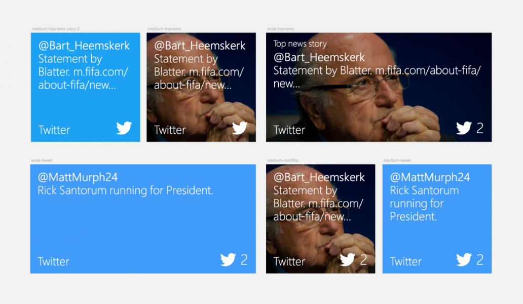
Of course the work isn’t just in the visual design, but also determining which content to show. As it is on the rest of the Start Menu, showing content on a Live Tile is a big responsibility. We put a lot of work into showing the most relevant content possible so the experience is timely and, we hope, delightful.
That’s our peek into the design process we undertook for the latest version of Twitter for Windows. We’d love to hear your feedback, so please Tweet using #twitterforwindows and we’ll make your insights part of our continued design process.
Designed in collaboration with Jon Bell, Mike Kruzeniski, Jeremy Forrester, David Gasca and Abheek Gupta
Did someone say … cookies?
X and its partners use cookies to provide you with a better, safer and
faster service and to support our business. Some cookies are necessary to use
our services, improve our services, and make sure they work properly.
Show more about your choices.