
Designing with constraint: Twitter's approach to email
Friday, 20 November 2015
When you think of Twitter, you probably don’t think of email. Hashtags, witty commentary, and breaking news all might come to mind quicker than email. But email actually plays a crucial role in the user experience.
Emails from Twitter serve a lot of purposes for different people, whether it’s a confirmation email after signing up for an account or one that recommends accounts to follow months later. Each one needs to have a consistent look and feel, without compromising their specific function or purpose. And this must be done while supporting how emails display on a myriad of devices, operating systems, web browsers, and email providers.
All of this makes designing emails challenging, but as a designer who can take ideas and develop and code them out, I’ve got a leg up on it. Combined with a few guiding principles, it’s a surmountable (and even fun) challenge.
It’s helpful to start an email design discussion with some guiding rules. Through iterative testing, and a continual desire to learn, my colleague Emily Miller and I have created these three email design principles:
1. Keep it light, keep it concise
It’s been said that people can spend as few as three seconds in an email. It’s extremely short, and a person reading an email on the bus on their phone is in a completely different mindset than the person bored out of their mind in the office. The challenge is serving them both.
That’s why we lean toward keeping our copy and content short, informative, and valuable. Typography, color, and hierarchy all play a role in helping the eye jump to what’s important. Equally important is how the message is phrased. Quick, efficient comprehension relies on excellent copy that communicates succinctly — a task made easier with the help of a great copywriter.
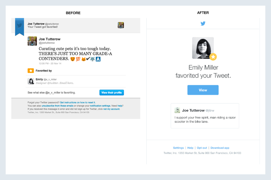
The redesigned “favorite notification” email utilizes improved type hierarchy, shorter copy, and a more prominent call-to-action to communicate its message quickly.
A little design exercise we’ve developed over time is to assume someone will only read a subject line, the first headline in the email, and the call-to-action (the biggest visual anchors). If everything else was removed, would it still make sense? That’s the north star we aim for when designing an effective email.
2. Meet a person where they are
Email needs to work whether someone’s on their iPad at home or desktop at work. This means understanding the technical challenges of a myriad of devices, platforms, and applications out there and aiming for consistency across them. An email from Twitter needs to get the same message across, regardless of where it is received.
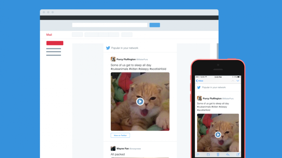
The design for the network digest email took into account that it would need to scale across a multitude of devices.
3. Help a person do something
Our final email design principle is to always get someone back to the product in a way that helps them do something valuable.
An email, like any notification, needs to quickly inform a person about something relevant and then allow them to act on that information. For example:
If a message can’t help someone get back to the product to do what’s meaningful to them, it’s not worth sending.
Email principles mean little if you can’t apply them. Typically the design process involves working with an engineer to bring designs to life and iterating along the way. However, emails are a bit of a special case. They’re usually created with outdated HTML and CSS standards so older email clients aren’t left out, then progressively enhanced with newer standards for newer phones. It’s a little niche, and turns out you can move a lot faster when one person can both design and code.
Take Microsoft Outlook, for example. It’s been a popular email desktop application for years, but it can sometimes be tricky to render an email within it. Outlook, like many email applications, doesn’t display modern HTML and CSS well (or sometimes at all). That means navigating a minefield of rendering issues to arrive at a design that works.
Among some of Outlook’s more interesting quirks are:
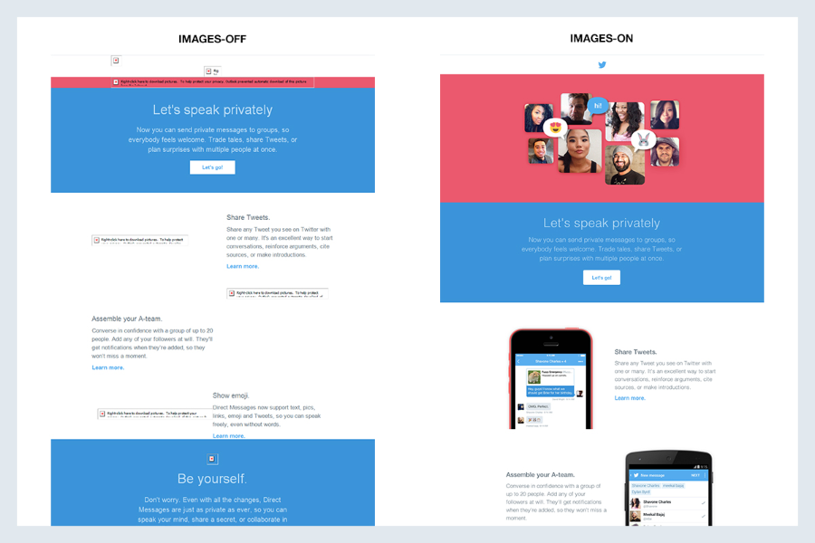
A product announcement email rendered in Outlook with images-off (left) vs. Apple Mail with images-on (right).
One of the implications is how email designs use images. In a world where images may not be displayed at all, how the design communicates without them needs to be front of mind. Furthermore, where we can rely on animation in other email clients, Outlook freezes animated GIFs on their first frame — another quirk to keep in mind when developing imagery for email.
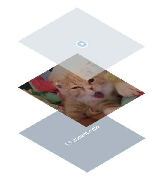
To illustrate the point a little more, take a look at a Tweet with a video in email. The still imagery with a play button overlaid atop affords that this is a video that will play when clicked. Pretty standard stuff. But to get here required some technical savvy since an image with a play button is not generated for us.

An example of a Tweet with a video as rendered in a digest email.
To support videos as more than mere images, we identified the four most common aspect ratios people were uploading: 1:1, 1.33:1, 1.36:1, and 1.77:1. We used this to create four transparent PNG images at those aspect ratios, with the play button in the center. In code, the video thumbnail becomes a background image, with the PNG play button laid on top. Sizing the PNG to the specific aspect ratios assures the play button remains centered, even as designs flex to adapt to different screen sizes.
Support for playable media in email requires a unique solution that blends both savvy design thinking and interesting code.
Outlook requires the extra step of using Vector Markup Language (VML) — a language used pervasively throughout older Microsoft Office applications and Internet Explorer — to get background images on video thumbnails working. It was never widely adopted, so it’s somewhat obscure.) By using conditional comments that only target Outlook, this markup can be used to create an Outlook-specific solution in which videos look like, well, videos.
We’re only scratching the surface by discussing Outlook and one specific email. There are a handful of other email clients with just as interesting quirks and issues, and, of course, other emails with different design considerations. It’s worth the extra effort to ensure everyone receives a great experience, no matter the email client they choose. By designing and coding solutions together, we achieve solutions that make messages as clear and easy to understand as possible.
Emails designed and created in collaboration with Emily Miller.
Did someone say … cookies?
X and its partners use cookies to provide you with a better, safer and
faster service and to support our business. Some cookies are necessary to use
our services, improve our services, and make sure they work properly.
Show more about your choices.