
Infrastructure
Capping image fidelity on ultra-high resolution devices
By
Thursday, 9 May 2019
We shipped a small, unnoticed change to our iOS, Android and RWeb clients in January that had a great improvement for people on high end mobile devices. Images in timelines on ultra-high resolution devices now load roughly 33% faster while using 1/3rd less data, and with no visible quality change.
What did we do?
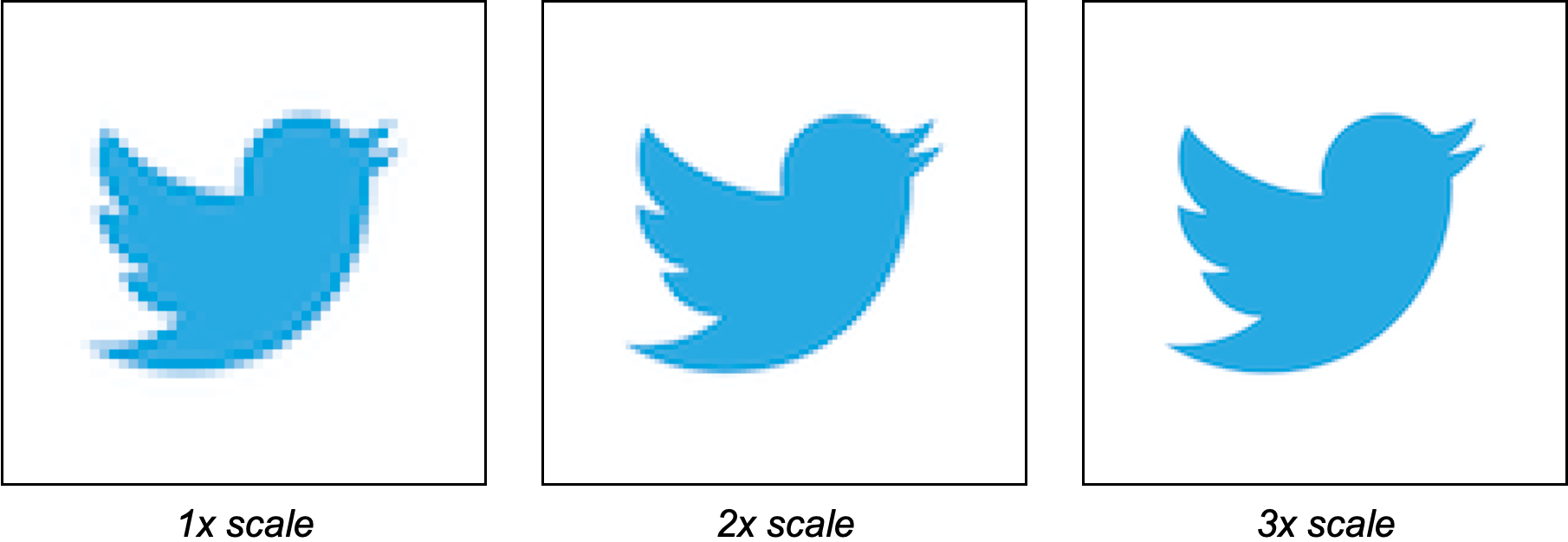
More and more people are getting devices with ultra high density screens, sometimes called super-retina (since they have more resolution than the human eye can see). The original iPhone set the norm for screen resolution density on mobile devices, which we call 1x scale (1x1 pixel per dot). Retina devices (pixels small enough the human eye can't see the pixels) started becoming popular in 2010, which we call 2x scale screens (2x2 pixels per dot). Now, we have people adopting ultra high resolution devices that are past 2x scale, being 3x scale (3x3 pixels per dot) or beyond.
A consequence of these ultra high resolution screens is that the number of pixels a person sees of an image in the same physical area is much higher. This leads to an increase in data usage and load latency for loading those images.
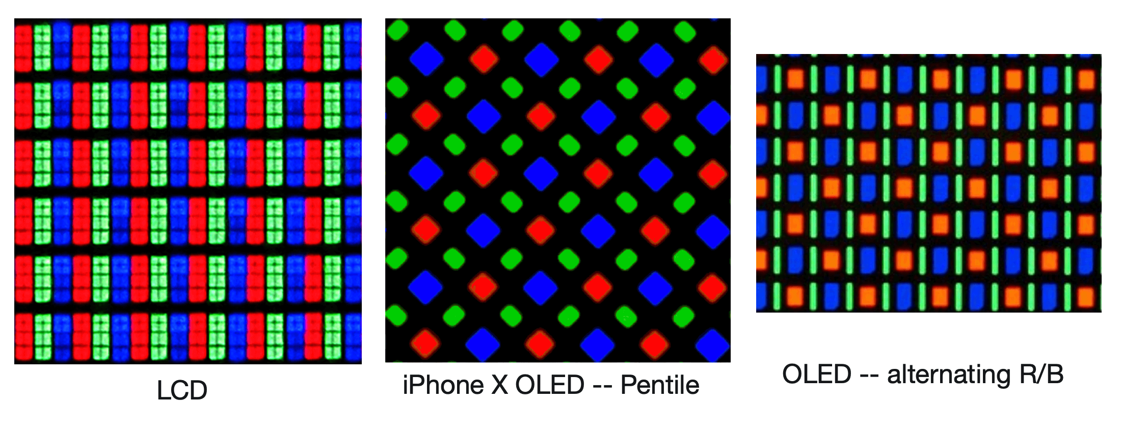
The most modern screens are OLED. These screens boast some really great features like pure blacks, and are marketed as 3x scale. However, nearly no "3x scale" OLED actually has perfect 3x3 pixels per dot on their screen.
This means that most OLED screens that say they are 3x resolution, are actually 3x in the green color, but only 1.5x in the red and blue colors. Showing a 3x resolution image in the app vs a 2x resolution image will be visually the same, though the 3x image takes significantly more data. Even true 3x resolution screens are wasteful as the human eye cannot see that level of detail without something like a magnifying glass.
What does this change look like?
There's no difference that the human eye can see, but will save 38% on data and 32% on latency on the capped image load for this particular example which is reflective of most images that load on Twitter.
How did we do it?
We made a change to Twitter for iOS, Twitter for Android and Twitter RWeb to check if the screen resolution is higher than 2x and, if it is, we will calculate the variant/size to load as if the screen was 2x. However, when viewing images in the gallery, we always will load the full image.
What's does this change mean for you?
If you have a modern mobile device with an ultra-high resolution screen, you will see images load faster while having less data used without seeing any difference in quality. Enjoy!
Did someone say … cookies?
X and its partners use cookies to provide you with a better, safer and
faster service and to support our business. Some cookies are necessary to use
our services, improve our services, and make sure they work properly.
Show more about your choices.
